SMAD 203: Information Architecture Project Fall 2024
In the Fall Semester of 2024, I took an introductory course to UX Design. This course was taught by Professor Matt Leech and he introduced us to the basics of coding and website design, and also taught us how to go about creating innovative apps. He showed us how to go about brainstorming a concept and the steps it takes to turn an idea into a product.
Assignment Overview
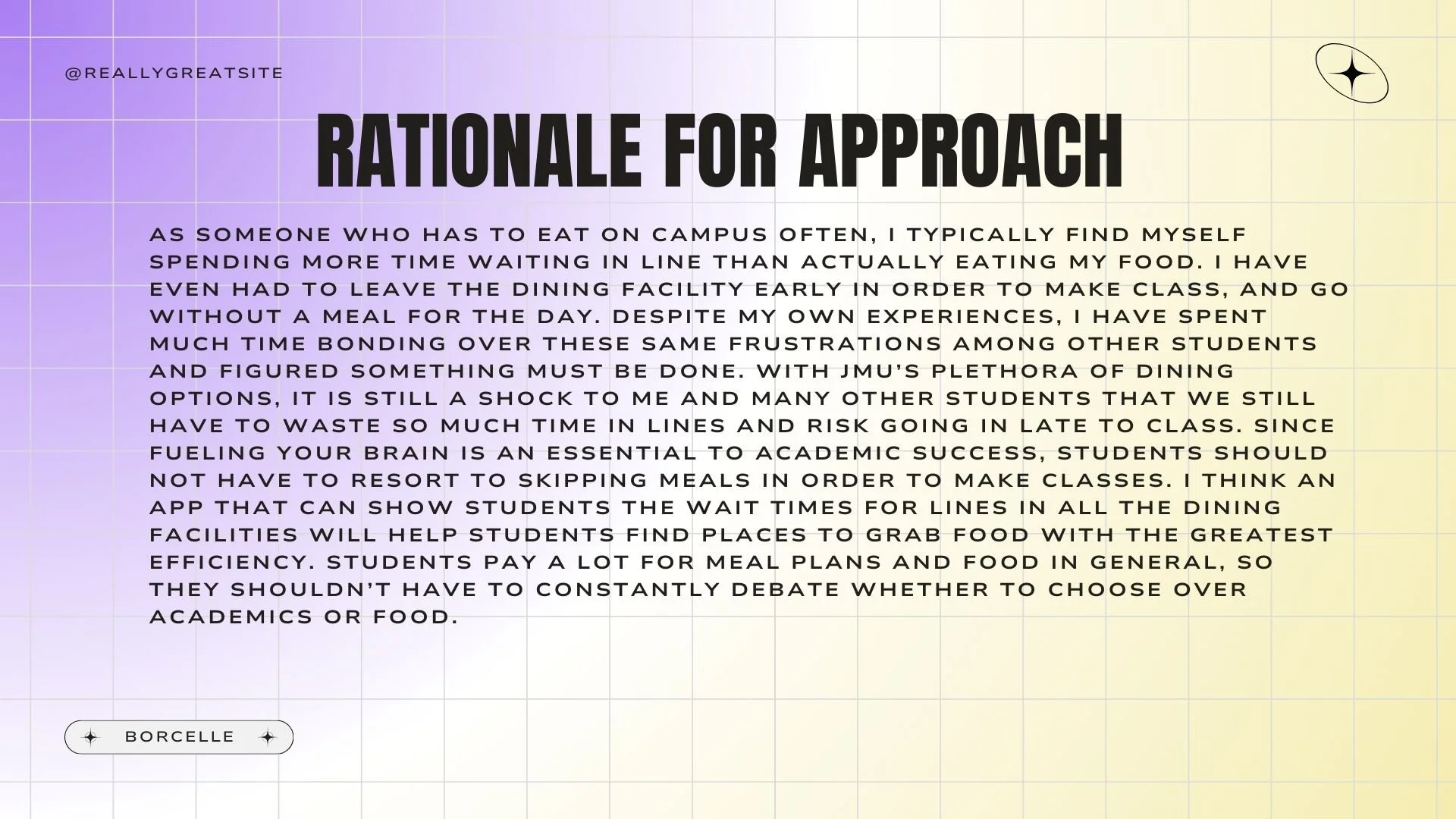
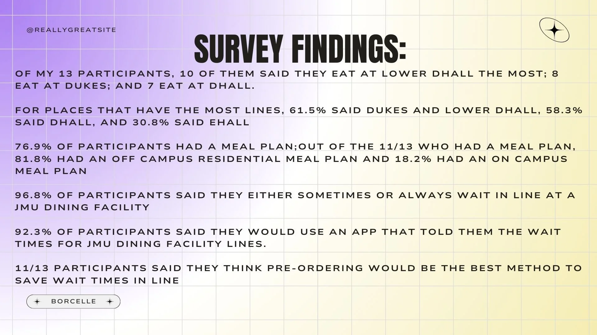
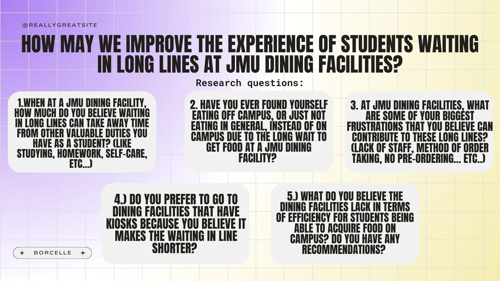
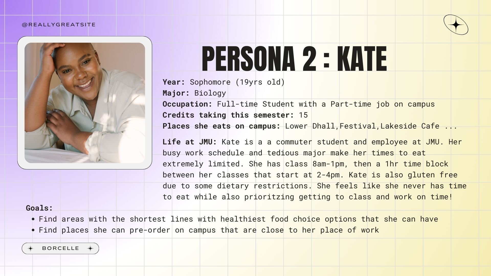
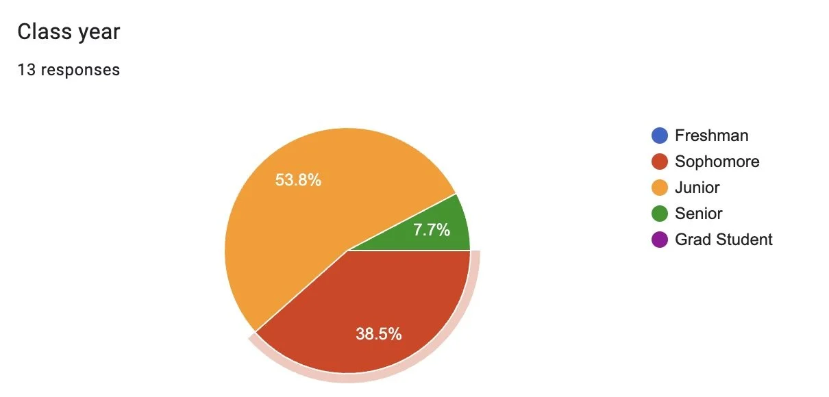
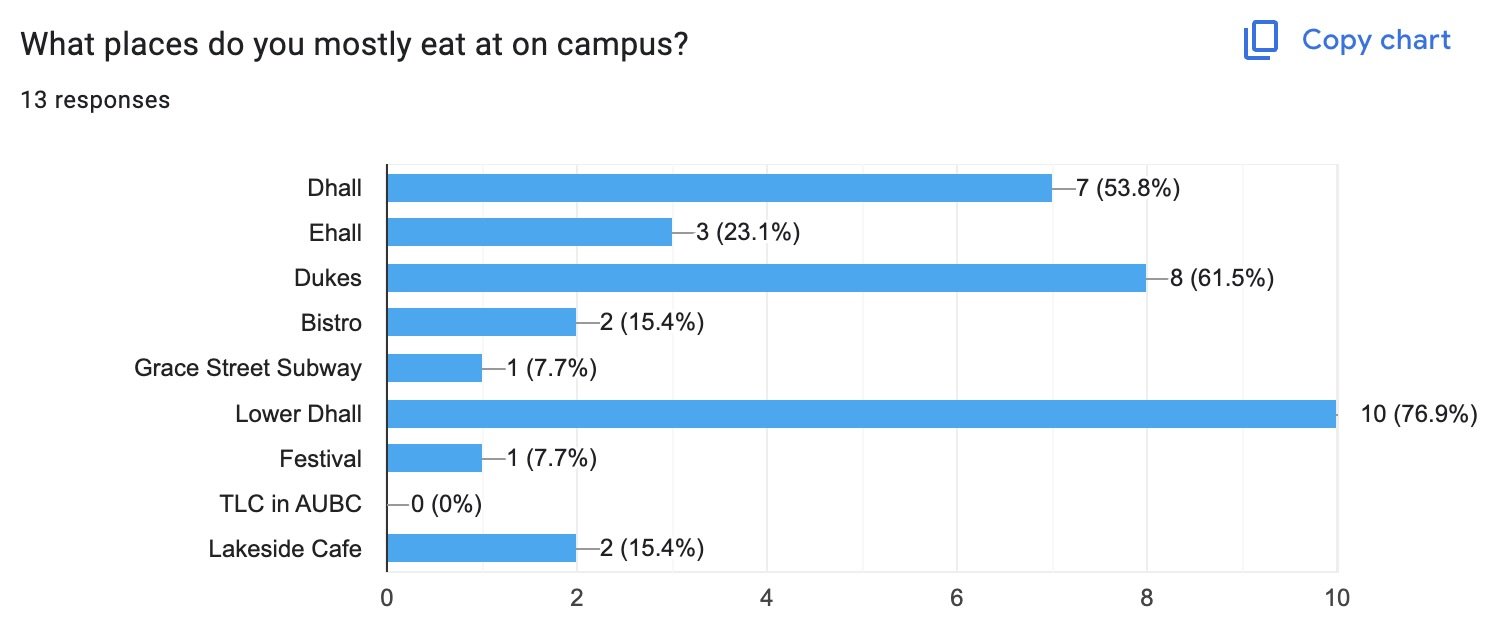
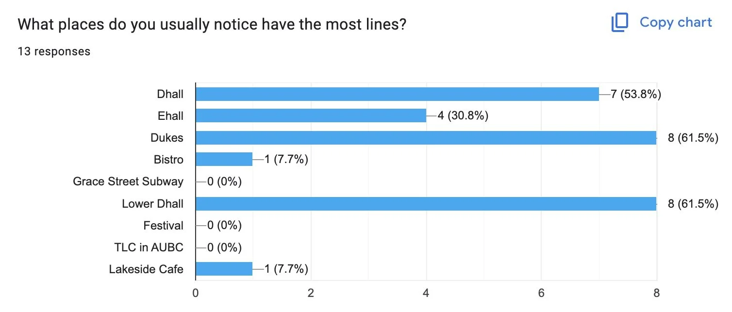
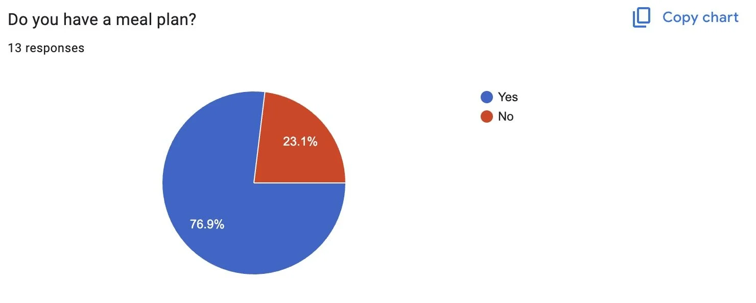
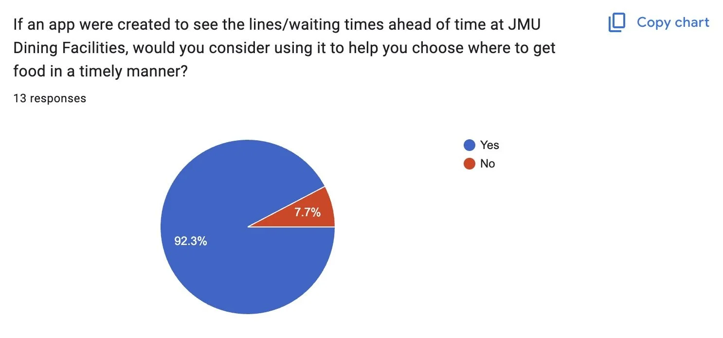
The first project we were tasked with was coming up with the concept of an app that could benefit JMU students. We had to brainstorm various pain points we have and try to find a way for this app to relieve students of these issues. The topic I chose was the long lines at dining facilities. I felt that this inconvenience took away from time I could be studying, socialize with friends, or completing school work in general. I also found myself having to skip meals and sacrifice being hungry just to make it to classes on time. So, to make sure this generalization truly applied to other students, and not just myself, I created a poll via Google Forms and sent it out to members of JMU to get their opinion on the matter. The survey is linked here, and the results of this survey are pictured below:
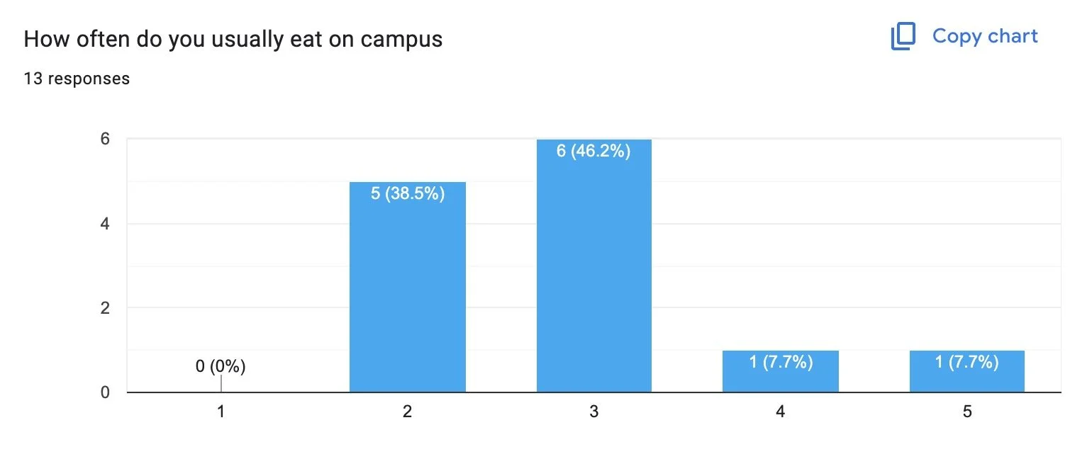
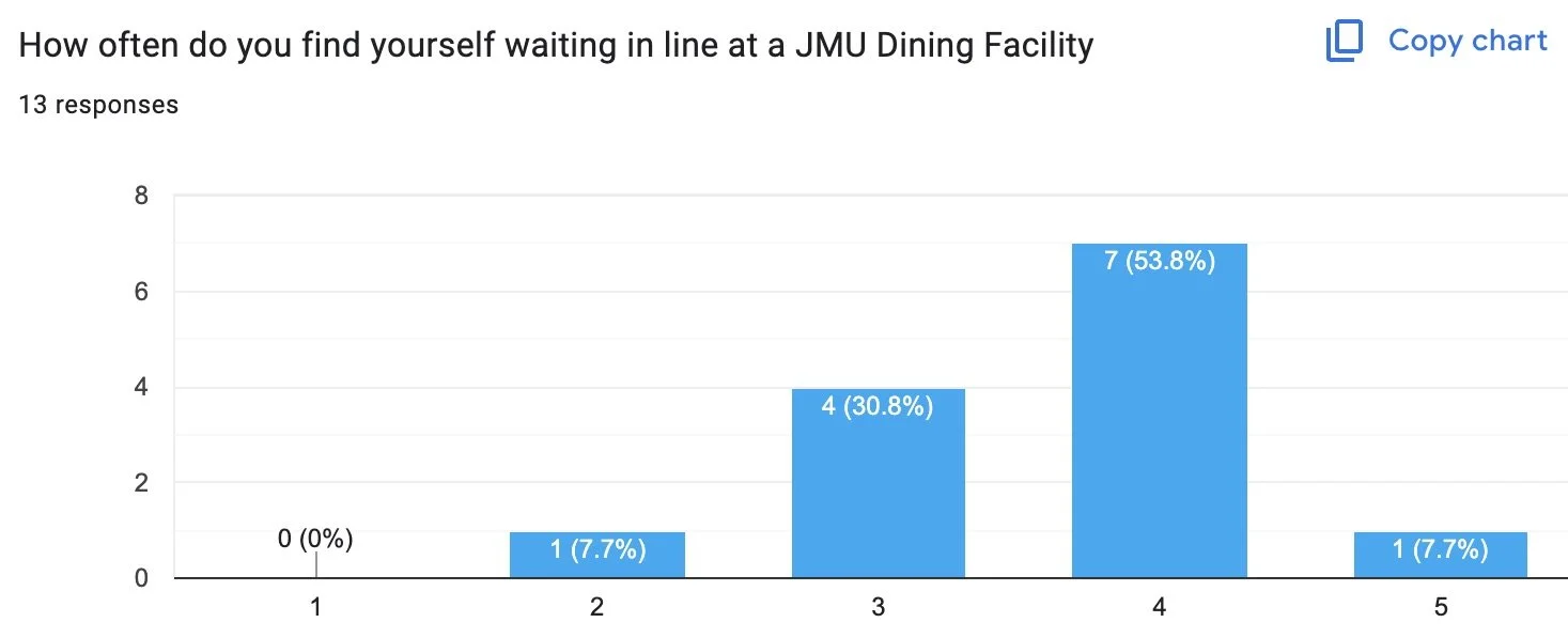
1 being never, 5 being always
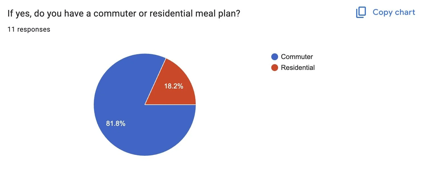
Commuter meal plans are for those students who go to JMU, but either live in apartments/houses off our main campus (freshman commuters & some sophomores - seniors). Residential meal plans are for anyone who lives in a dorm.
1 being never, 5 being always
Next Steps
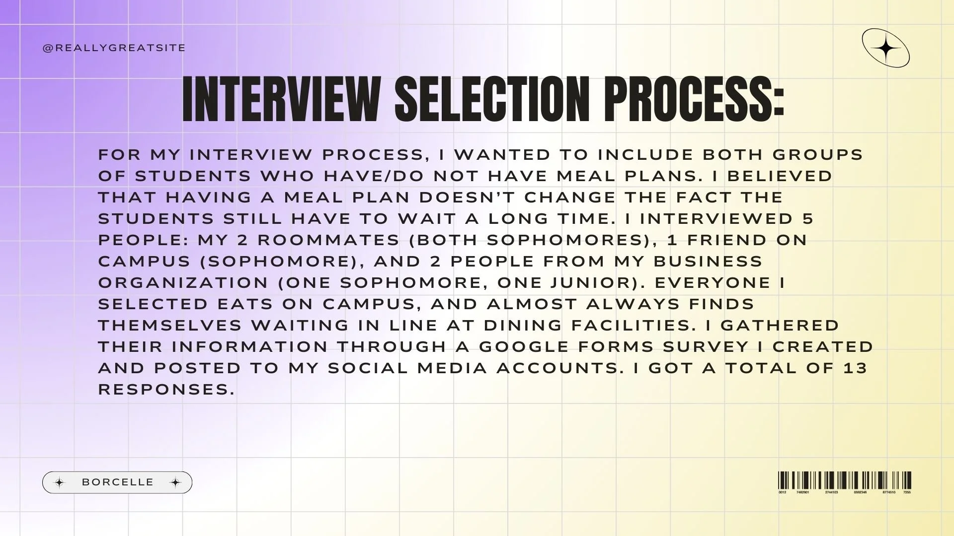
From this survey, I chose 5 people to interview face-to-face and asked them a series of five follow-up questions. This group included both men and women, people with residential & commuter meal plans (and even no meal plan), and sophomores and juniors. These questions asked about personal specific situations and scenarios to keep in mind when developing my app. The exact questions are within the final presentation and the end here.
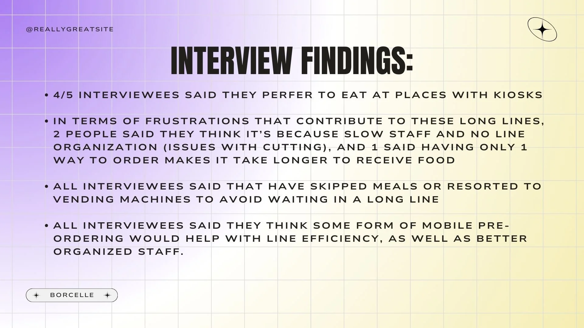
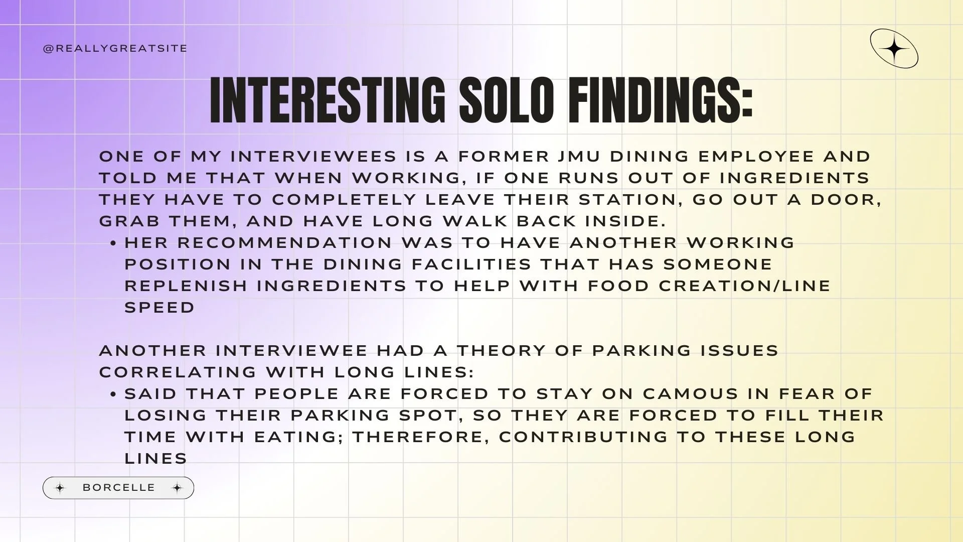
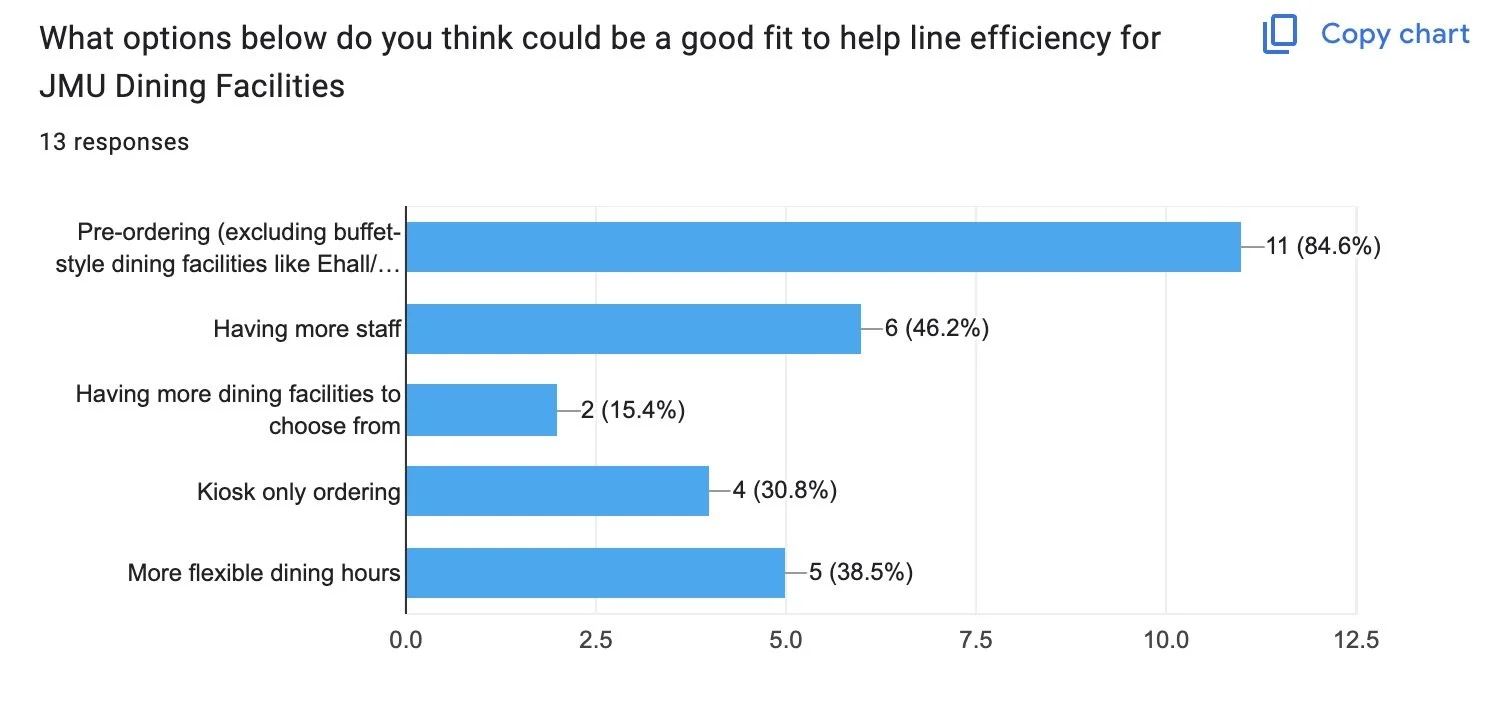
After the interviews were over, I found that many of the students liked to eat at places with kiosks. These are machines that allow students to quickly select what they want and it completely avoids human interaction, something that some people feel slows down the process of getting their food. Many students believed that the staff training could be an issue, due to disorganization of line flow and lack of timeliness, and even care, when making the food. All students have skipped a meal at some point in time to make it to class, and they all said a single app with a pre-order feature would be beneficial for line management.
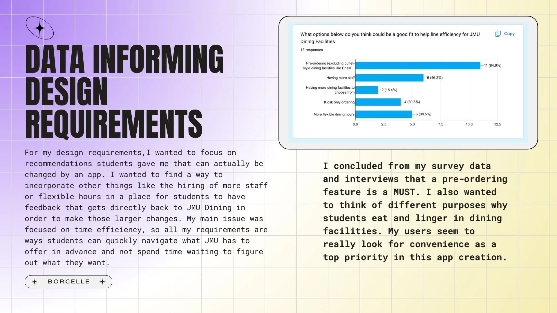
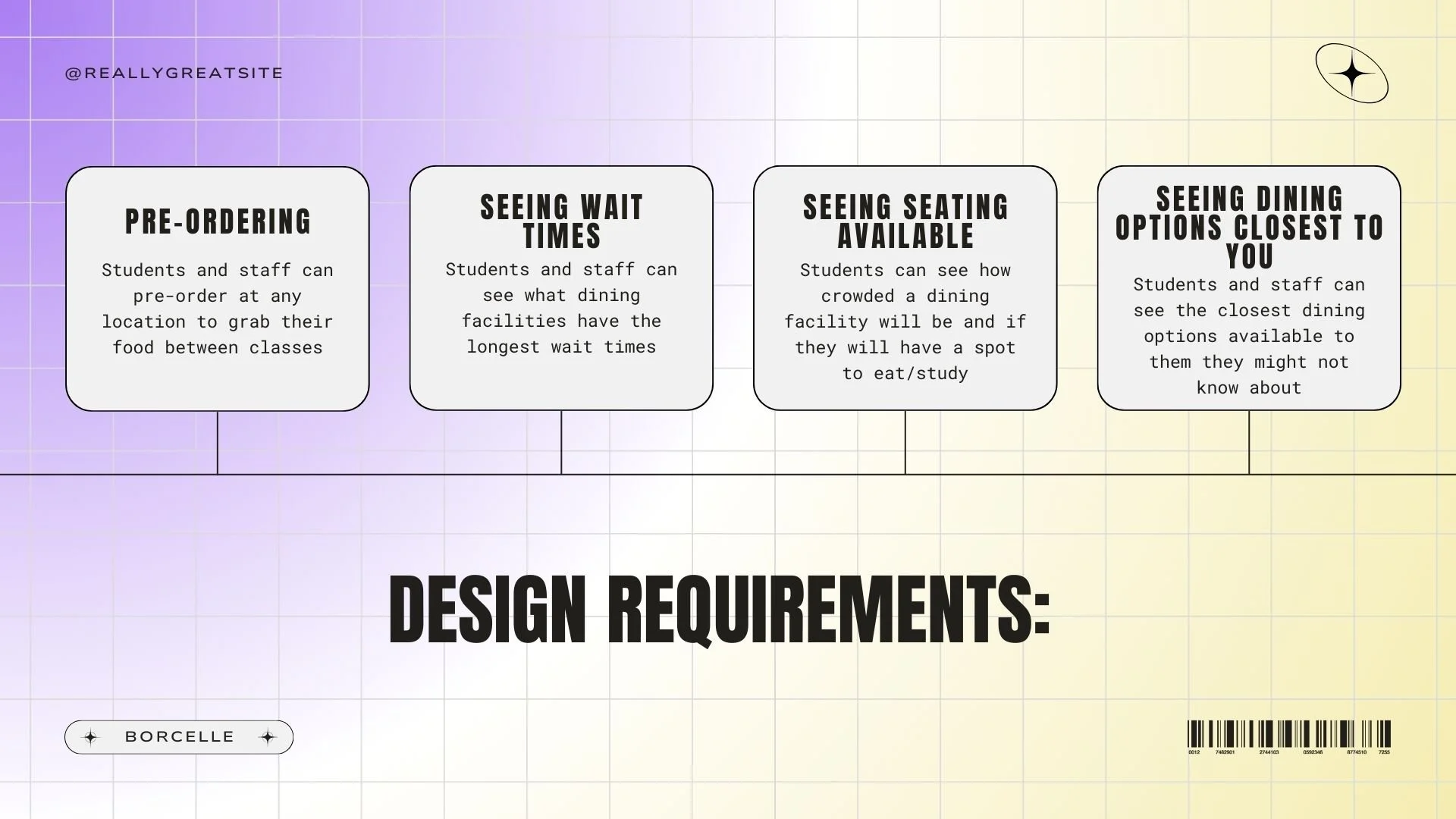
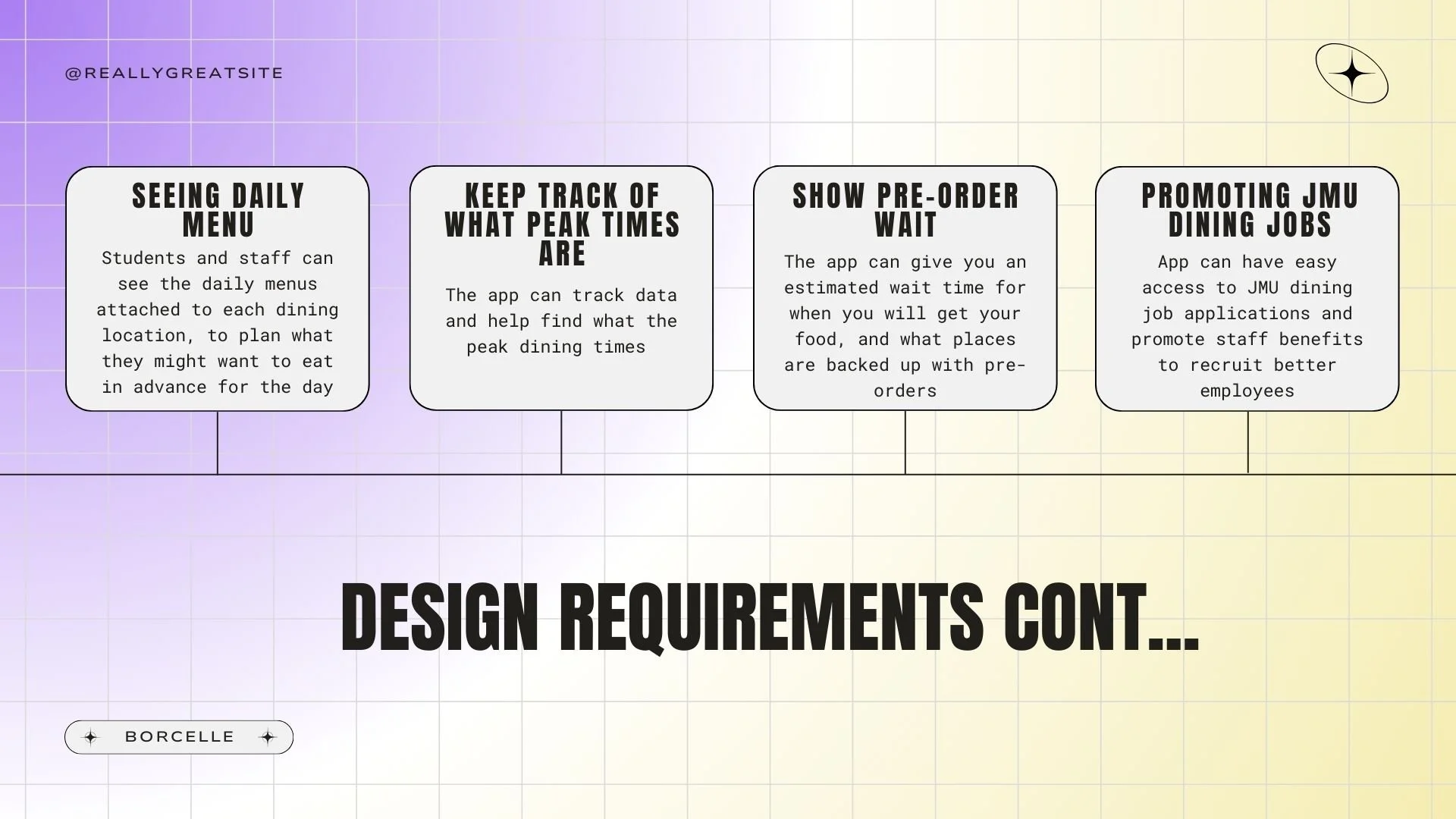
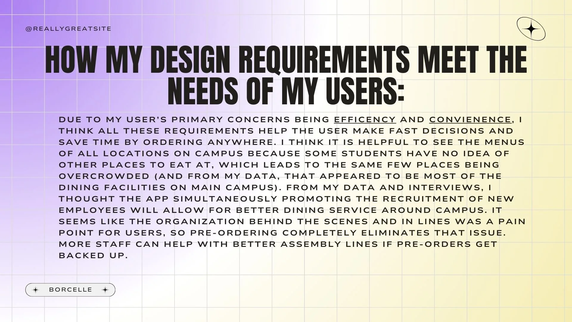
From the data I collected, I narrowed down some design requirements that I believed were necessary for this app. They were : being able to pre-order food; seeing the wait time, seating available in each facility, options closest to you and their daily menus, and their pre-order waiting time; a section that can analyze the peak times for each facility; a section to promote JMU Dining jobs. I feel as though all of these things help promote the main goals of the students that are centered around convenience and efficiency. I felt that the section promoting JMU Dining jobs was relevant because part of the issue people observed was a lack of staff to uphold the dining rush.
Design Requirements
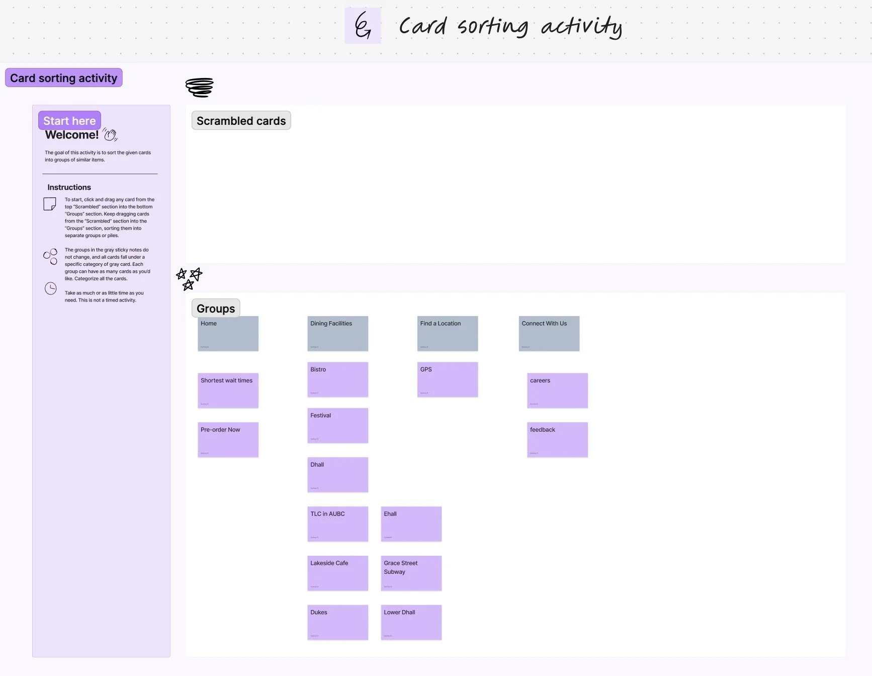
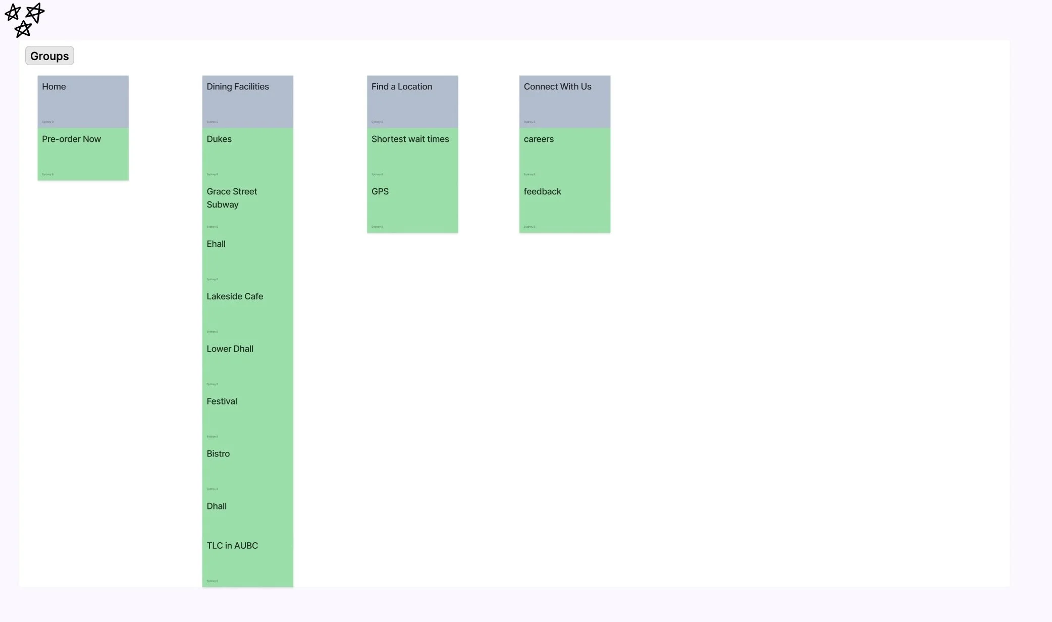
Now that I had specific details on what I actually wanted on the app, I figured it was time for me to work on the internal experiences of the app. I wanted to have an intuitive design that didn’t make the user have to think so hard, especially since the audience wants something convenient. To correctly develop this, I created a card sort using Figma. This had my main navigation in color at the top, and the sub-folders below. My card sort is below:
Developing the Navigation
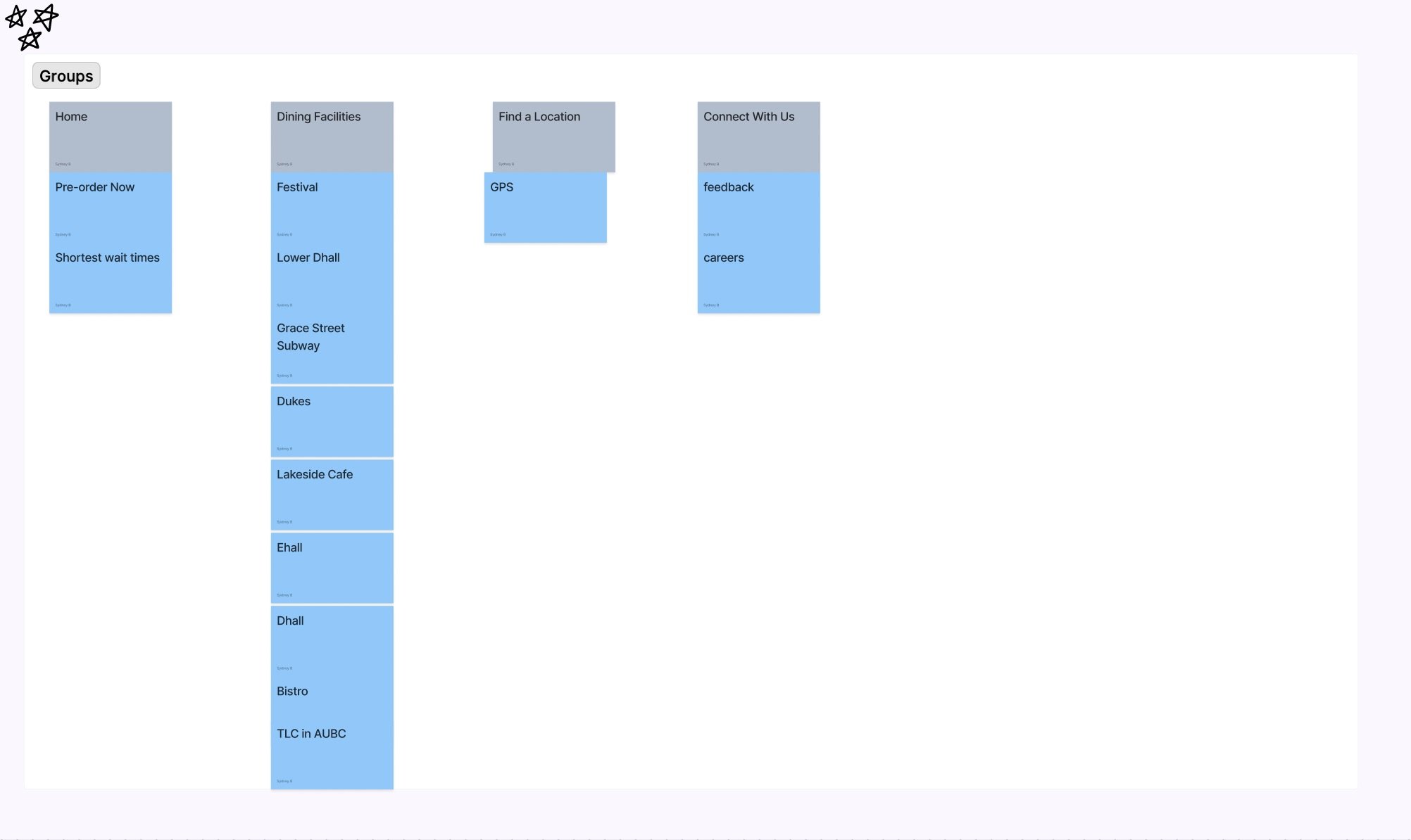
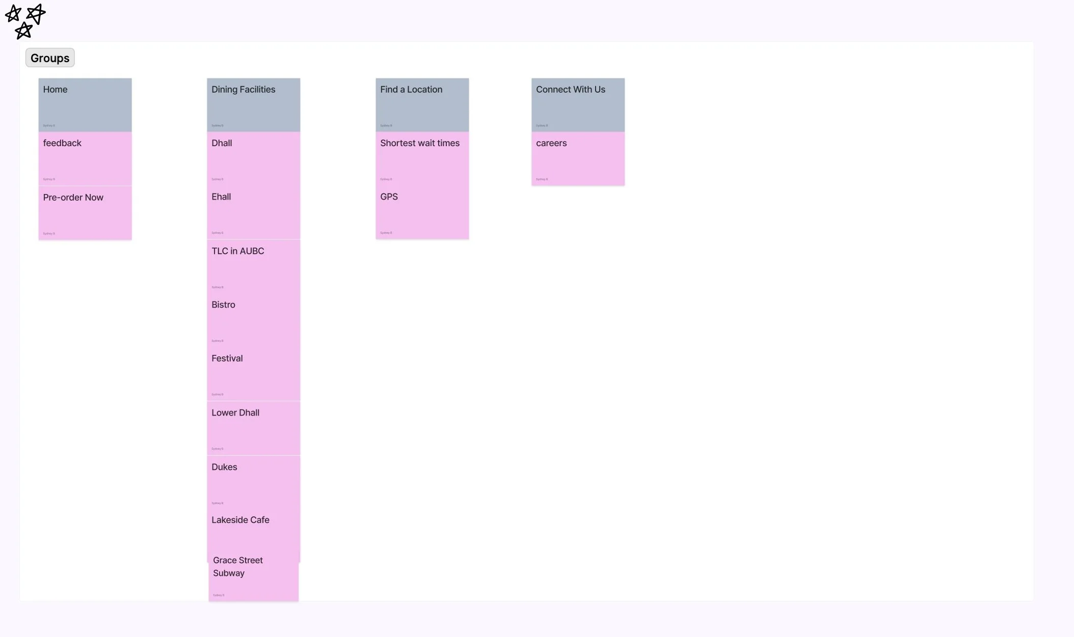
To make sure that other users of this app would think the navigation choices I made would also make sense, I made shuffled copies of this card sort and sent it out people I interviewed. Some of their results are in the carousel below:
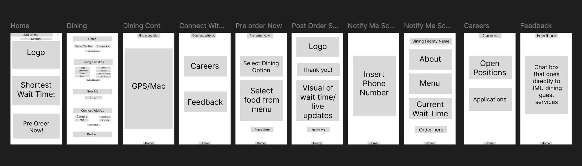
Now that I cleaned up the navigation for the app, I decided to make some wireframes for how I want the app to look and flow using Figma. The wireframes are pictured below:
App Wireframes
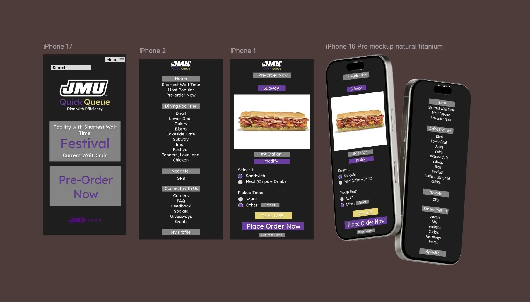
Design Mockups
Finally, the last step in this project was to develop the actual design itself for the app. The mockups I made are pictured below:
Now that the concept of the app is finished from idea to mockup, it was time to put my research in a single presentation to submit to my professor. One is a slide presentation made with Canva, and one if a Figma board that contains all information visually. The presentation is attached below and the link to the Figma board is provided here for viewers to access. The board dives deeper into the rationale for the navigation and analyzes other similar apps and competitors.
Final Presentations